Enhance project UI #212
Description
User feedback:
-
The "Select Mode" button under the "Your Images" section can be confusing to understand in terms of its functionality.
-
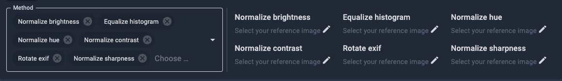
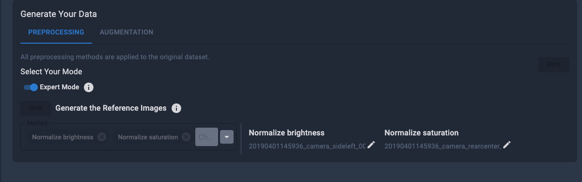
it’s somewhat repetitive, I guess you could use a simple dropdown on the left and just add the delete icons to the right beside the edit icon (for preprocessing and augmentation)
-
when generating the reference images, I’d also love to see the progress there instead of having to navigate away to the tasks page
-
when forcing the error state for the ref images, then navigating away and back again, it does not seem to get cleared again
-
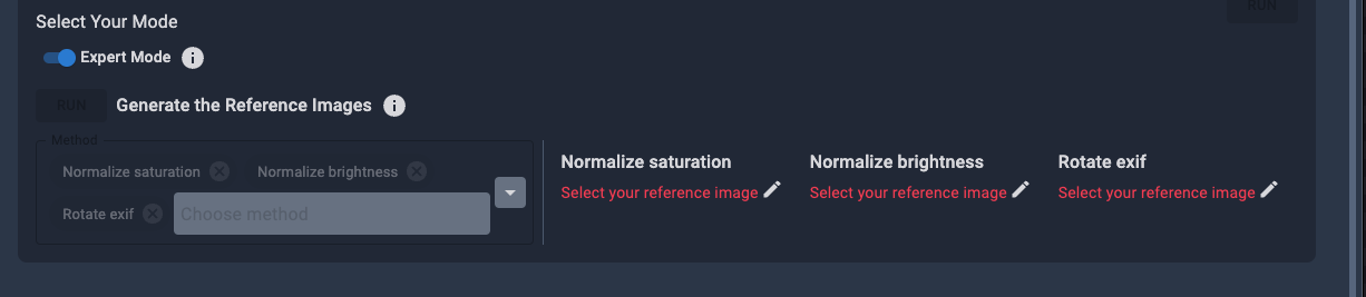
I also find this a bit confusing, should this be a checkmark instead? and if it’s set you don’t ask the user again to set a reference image but just automatically generate it when clicking on the run button in the top right corner?
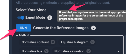
I guess could then still be useful to allow the user to manually specify a reference image where necessary
-
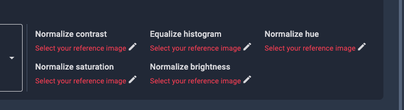
a reference image is required for grayscale & exif methods. This shouldn't be the case
-
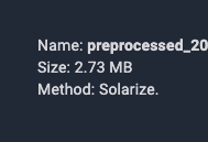
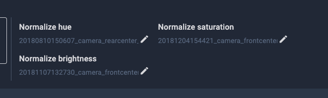
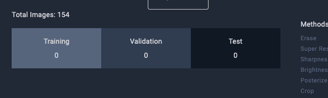
would be cool to see thumbnails here as well if possible
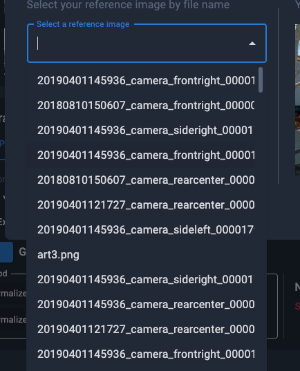
would then also consider showing the thumb here as well
-
Show progress not only in the task dashboard but also next to the actions
-
when leaving the screen here once it’s started and coming back it doesn’t inform me that the action is pending
maybe inform the user that preprocessing first needs to be finished here?
-
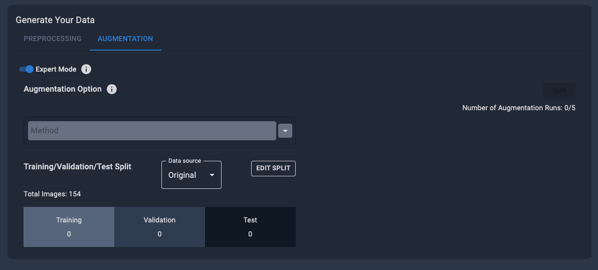
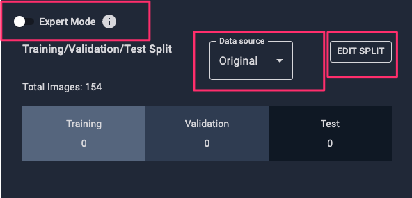
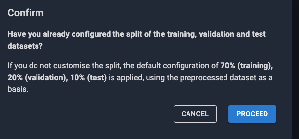
since visually it suggests 1/3 splits would that make sense as a default?
-
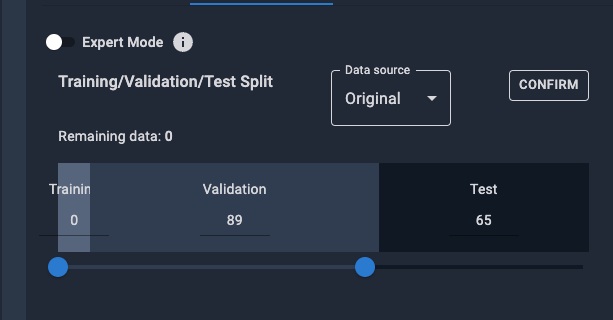
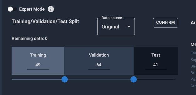
would also be nicer when clicking on edit since the dots wouldn’t end up on each other
-
there’s no option to cancel here again, if I by mistake make a shittty change
-
would move that button to the bottom (for preprocessing and augmentation)
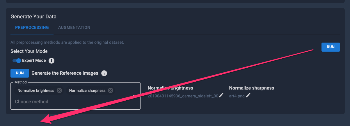
another user also complained about that: The "RUN" button for the "Generate Your Data" section is too far off and disassociated with the rest of the text in there. -
I’d clean up the button placement a bit here
-
instead of having an edit button why not showing this state directly and storing the split when clicking on run? that would eliminate the button
-
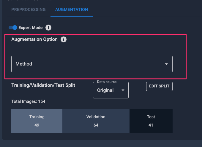
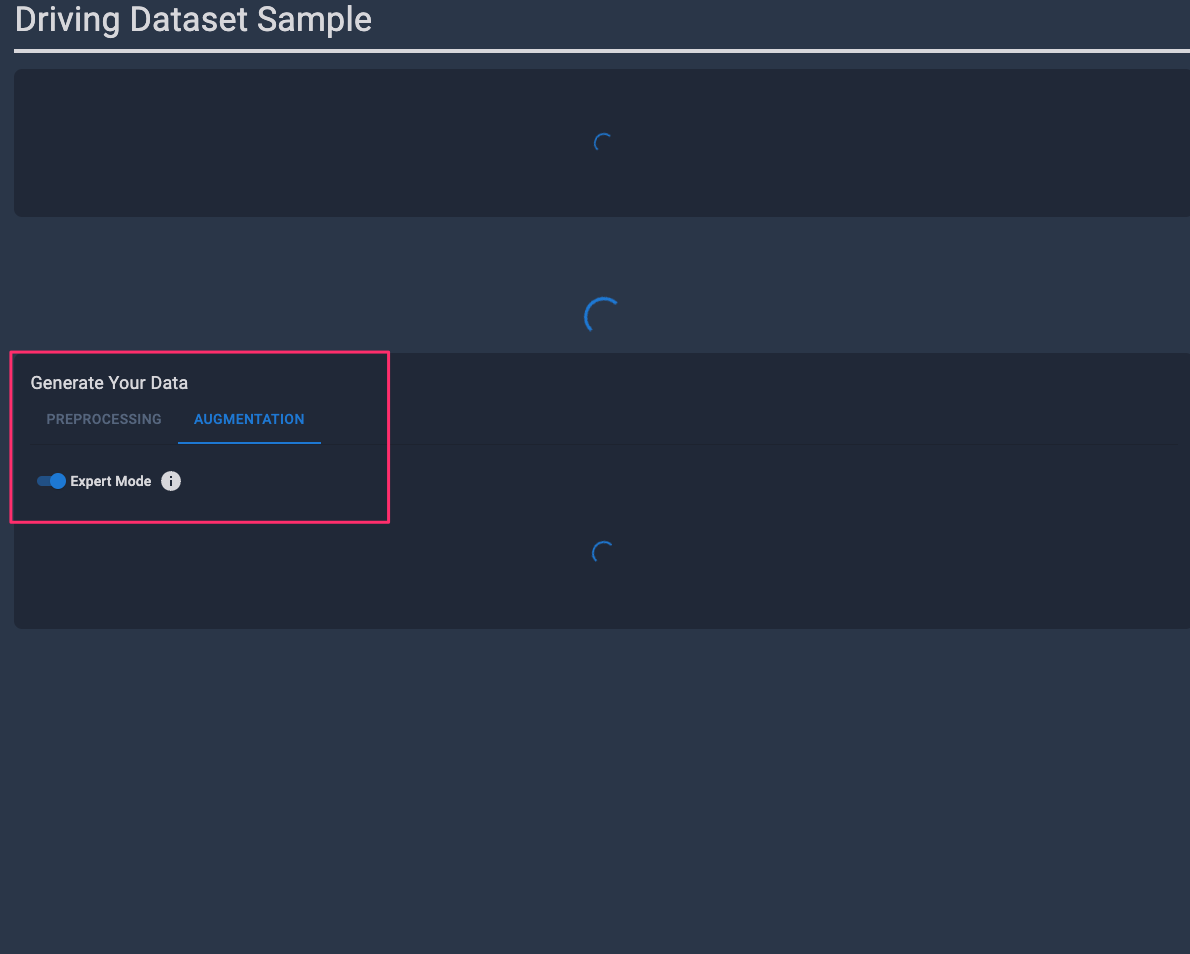
when triggering the augmentation it’d also be nice to get some pending indicator there so I’d immediately know why it’s inactive
-
shouldn’t this be shown below the split since they’re applied on the split that is selected, would also be more in line with the non-expert mode where options are displayed to the right
-
I’d just configure the split this way as a default instead of adding an additional dialog
-
I’d also hide this part while loading so it’s consistent
-
would it make sense to show the parameters here as well?