Layout exercise #7
Conversation
7-layouts/style.css
Outdated
| @@ -0,0 +1,135 @@ | |||
|
|
|||
7-layouts/style.css
Outdated
|
|
||
|
|
||
| .banner { | ||
| align-items: center; |
There was a problem hiding this comment.
is this property being used?
There was a problem hiding this comment.
Not really, but I changue te property to justify-content and I can see the change
7-layouts/style.css
Outdated
| .description_movie { | ||
| display: flex; | ||
| height: 80%; | ||
| width: 100%; |
There was a problem hiding this comment.
is this property working?
width: 100%;
7-layouts/style.css
Outdated
| position: sticky; | ||
| top:3%; | ||
| background-color:#333332; | ||
| font-size:x-large; | ||
| height: 30px; |
There was a problem hiding this comment.
please sort these properties
7-layouts/style.css
Outdated
| margin-left: 20px; | ||
| margin-right: 40px; | ||
| color: white; |
There was a problem hiding this comment.
please sort these properties
| } | ||
|
|
||
| img { | ||
| height: 100%; |
There was a problem hiding this comment.
is this property working?
height: 100%;
There was a problem hiding this comment.
That property prevent that the images that have a big height size have the same size without write the quantities
7-layouts/style.css
Outdated
| } | ||
|
|
||
| p { | ||
| font-family: Georgia, 'Times New Roman', Times, serif; |
There was a problem hiding this comment.
| font-family: Georgia, 'Times New Roman', Times, serif; |
7-layouts/style.css
Outdated
| margin-top: 2%; | ||
| } | ||
|
|
||
| p { |
There was a problem hiding this comment.
| p { | |
| .paragraph { |
|
|

7-layouts/style.css
Outdated
| padding-left: 10px; | ||
| padding-right: 10px; |
There was a problem hiding this comment.
| padding-left: 10px; | |
| padding-right: 10px; |
7-layouts/style.css
Outdated
| } | ||
|
|
||
| h1 { | ||
|
|
7-layouts/style.css
Outdated
| h2 { | ||
| font-size: x-large; | ||
| width: 70%; | ||
| padding-bottom: 6%; |
There was a problem hiding this comment.
| padding-bottom: 6%; |
7-layouts/style.css
Outdated
|
|
||
| p { | ||
| font-size: 70%; | ||
| } |
There was a problem hiding this comment.
| p { | |
| font-size: 70%; | |
| } |
7-layouts/style.css
Outdated
| article { | ||
| width: 40%; | ||
| } | ||
|
|
There was a problem hiding this comment.
| article { | |
| width: 40%; | |
| } | |
7-layouts/style.css
Outdated
| @media screen and (min-width: 545px){ | ||
| h1 { | ||
| font-size: 400%; | ||
| } | ||
|
|
||
| h2 { | ||
| font-size: x-large; | ||
| width: 40%; | ||
| padding-bottom: 3%; | ||
| } | ||
|
|
||
| p { | ||
| font-size: 130%; | ||
| } | ||
| } |
There was a problem hiding this comment.
is this rule being applied?
 juancho11gm
left a comment
juancho11gm
left a comment
juancho11gm
left a comment
There was a problem hiding this comment.
Hi Estefanía, please see the comments and send the changes. Please comment if you think otherwise
|
Hi Estefanía, two comments:
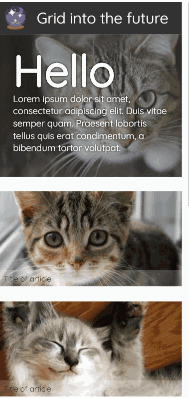
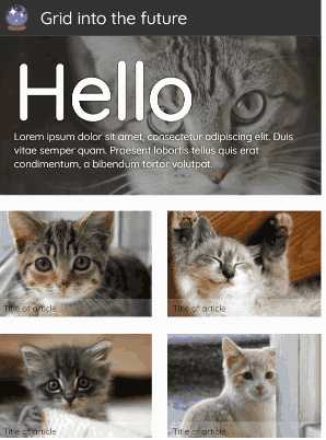
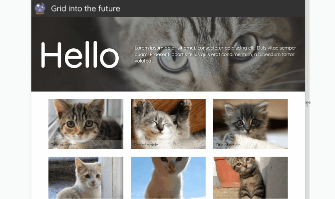
Mobile Tablet Desktop |
New layout exercise by Estefania Sora