New Image component #649
Closed
New Image component #649
Conversation
This file contains hidden or bidirectional Unicode text that may be interpreted or compiled differently than what appears below. To review, open the file in an editor that reveals hidden Unicode characters.
Learn more about bidirectional Unicode characters
This comment has been minimized.
This comment has been minimized.
Member
Author
|
I've moved this over from the old |
cartogram
reviewed
Mar 7, 2023
Contributor
There was a problem hiding this comment.
Instead of going from Image to Image and ImageLegacy, I think it makes more sense to go from Image to Image and AlphaImage first.
So rollout would happen in 3 stages
- add the new
ImageasAlphaImage(in non-breaking release) - rename the
ImagetoLegacyImageand renameAlphaImagetoImage(in next major release) - remove
LegacyImage(following major release)
@benjaminsehl what do you think?
Contributor
|
Taking this over from @benjaminsehl, I have some basic tests in and the build is passing, but going to give everything a second look and add a lot more tests as I go. |
benjaminsehl
commented
Mar 7, 2023
cartogram
reviewed
Mar 9, 2023
lordofthecactus
suggested changes
Apr 11, 2023
Contributor
 lordofthecactus
left a comment
lordofthecactus
left a comment
lordofthecactus
left a comment
There was a problem hiding this comment.
The new component seems to break the demo-store.
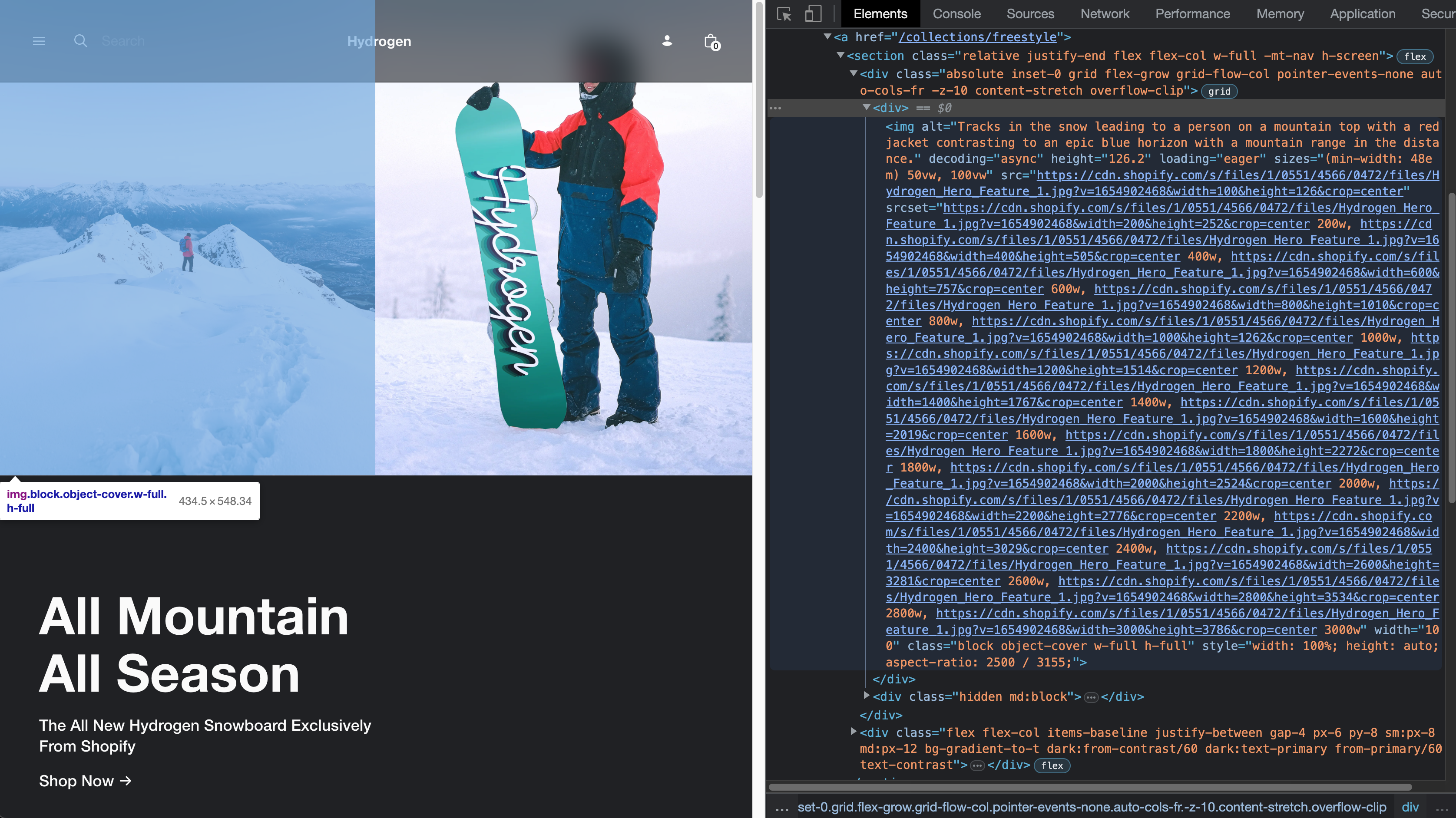
Couple of questions:
- I see the style attribute is used which has quite a strong specificity. The demo store broke so I'm thinking there might be a strong assumption here that these styles can apply broadly. How as it decided that this was to be included by default?
- I see it generates a large srcset. Is this the best practice when using cdn? how was this decided and are there any implications?
Sign up for free
to join this conversation on GitHub.
Already have an account?
Sign in to comment
4 participants
Add this suggestion to a batch that can be applied as a single commit.
This suggestion is invalid because no changes were made to the code.
Suggestions cannot be applied while the pull request is closed.
Suggestions cannot be applied while viewing a subset of changes.
Only one suggestion per line can be applied in a batch.
Add this suggestion to a batch that can be applied as a single commit.
Applying suggestions on deleted lines is not supported.
You must change the existing code in this line in order to create a valid suggestion.
Outdated suggestions cannot be applied.
This suggestion has been applied or marked resolved.
Suggestions cannot be applied from pending reviews.
Suggestions cannot be applied on multi-line comments.
Suggestions cannot be applied while the pull request is queued to merge.
Suggestion cannot be applied right now. Please check back later.
WHY are these changes introduced?
Improve developer ergonomics for working with the Image component and ensure greater performance across devices and screen sizes by making responsive images a default and accounting for common lighthouse warnings.
WHAT is this pull request doing?
<Image />now supports all unit types, and a more natural set of APIs (better aligned with standard HTML) for both for responsive and fixed with images.Example markup:
Would result in:
Sometimes you will just want a fixed sized image — we still generate
srcsetfor this, however, as different devices have different pixel densities. We also account for the compound property common on all our other components,dataso you can simply pass the response from the Storefront API and set the width.So this:
Would result in:
Notice that even though we didn't pass in an aspectRatio prop, we were still able to generate a correct style property, by using
data.widthanddata.height.Todo:
Picture Element
In the future, this Image component would be able to be composed within a Picture component, which would look something like:
When inside the component
Imageshould render asourceelement, with the lastImagecomponent rendering aimgelement as the fallback. Ideally we'd somehow do that automatically — looking at the nodes of children, and then setting the as prop for you. Alternatively, our component could re-export the Image component but as a<Source />component — which would be in keeping with HTML semantics.HOW to test your changes?
Post-merge steps
Checklist