SF-3665 Improve dark theme #3637
Conversation
 marksvc
added
will require testing
marksvc
added
will require testing
Codecov Report✅ All modified and coverable lines are covered by tests. Additional details and impacted files@@ Coverage Diff @@
## master #3637 +/- ##
=======================================
Coverage 83.29% 83.29%
=======================================
Files 611 611
Lines 37646 37646
Branches 6182 6158 -24
=======================================
Hits 31358 31358
Misses 5345 5345
Partials 943 943 ☔ View full report in Codecov by Sentry. |
 RaymondLuong3
left a comment
RaymondLuong3
left a comment
RaymondLuong3
left a comment
There was a problem hiding this comment.
This is looking really good. For the major components like the lynx insight panel and the scripture editor this is a huge improvement. I didn't notice many issues but I noted a few. I am sure we will want to define a colour palette to choose secondary and accent colours eventually, but this is a nice step for dark theme.
@RaymondLuong3 reviewed 55 files and all commit messages, and made 5 comments.
Reviewable status: all files reviewed, 4 unresolved discussions (waiting on @marksvc).
src/SIL.XForge.Scripture/ClientApp/src/index.html line 27 at r1 (raw file):
    <link rel="manifest" href="manifest.json" />
    <meta name="theme-color" content="#343a31" />
    <style>
This seems like a strange place to be defining css rules but I see that this is outside of our angular app.
src/SIL.XForge.Scripture/ClientApp/src/app/translate/editor/lynx/insights/_lynx-insights.scss line 29 at r1 (raw file):
  --lynx-insights-status-indicator-bg-color: #fff;
  --lynx-insights-status-indicator-offset: 19px;
Why was this removed and hard code it into the component scss rule?
Code quote:
--lynx-insights-status-indicator-offset: 19px;src/SIL.XForge.Scripture/ClientApp/src/app/translate/translate-overview/_translate-overview-theme.scss line 14 at r1 (raw file):
    )};
  // The donut background functions both as a background color for the circle as well as an inside and outside edge
  // color.
The progress track should be updated in dark theme. It is hard to see the progress track.
src/SIL.XForge.Scripture/ClientApp/src/_text.scss line 12 at r1 (raw file):
@mixin color($theme) {
  $is-dark: mat.get-theme-type($theme) == dark;
Is there a way to get the cursor to be a different color. When typing in the editor I cannot see the cursor at all because the cursor is black.
 marksvc
left a comment
marksvc
left a comment
marksvc
left a comment
There was a problem hiding this comment.
Thank you. A key concern to me was not to cause any light mode regressions.
I updated the PR so that the Storybook can toggle between Light and Dark theme, as well.
@marksvc made 5 comments.
Reviewable status: all files reviewed, 4 unresolved discussions (waiting on @RaymondLuong3).
src/SIL.XForge.Scripture/ClientApp/src/_text.scss line 12 at r1 (raw file):
Previously, RaymondLuong3 (Raymond Luong) wrote…
Is there a way to get the cursor to be a different color. When typing in the editor I cannot see the cursor at all because the cursor is black.
That's important. Thank you. Fixed.
src/SIL.XForge.Scripture/ClientApp/src/index.html line 27 at r1 (raw file):
Previously, RaymondLuong3 (Raymond Luong) wrote…
This seems like a strange place to be defining css rules but I see that this is outside of our angular app.
Yeah, so we could presumably access and use compiled CSS files that the angular App is using, in order to define and use values from there. That could be looked into, but I just carried on with defining the styles in the file itself.
I just made an improvement to this file where it now uses the user's Appearance setting to decide upon using light mode or dark mode (rather than just the device setting).
src/SIL.XForge.Scripture/ClientApp/src/app/translate/editor/lynx/insights/_lynx-insights.scss line 29 at r1 (raw file):
Previously, RaymondLuong3 (Raymond Luong) wrote…
Why was this removed and hard code it into the component scss rule?
Some things seemed more appropriately written into the SCSS rather than used as variables. I see that in the end I have variables for a number of other lengths though. I am making it into a variable again.
src/SIL.XForge.Scripture/ClientApp/src/app/translate/translate-overview/_translate-overview-theme.scss line 14 at r1 (raw file):
Previously, RaymondLuong3 (Raymond Luong) wrote…
The progress track should be updated in dark theme. It is hard to see the progress track.
Got it. How's this:

|
Setting to draft. I need to fix something else. |
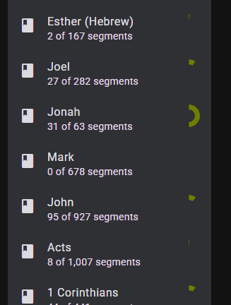
Adds or adjusts coloring for dark theme. Retains light theme colors,
or closely matches them.

Sometimes it wasn't clear how to make something appear in the Lynx
Insights area, to see how it looks.

The index.html "Loading ..." screen reads and uses the user appearance
setting independently so as not to potentially interfere with
application theming.

Some of the most significant areas that were improved for dark theme
include
  - Editor pane for target project
  - Red squiggly lines in the editor
  - Audio recording and playback
  - Lynx Insights panel
|
I fixed the problem and am marking the PR as not a draft; ready for review again. |
Adds or adjusts coloring for dark theme. Retains light theme colors,
or closely matches them.
Sometimes it wasn't clear how to make something appear in the Lynx
Insights area, to see how it looks.
The index.html "Loading ..." screen reads and uses the user appearance
setting independently so as not to potentially interfere with
application theming.
Some of the most significant areas that were improved for dark theme
include
I have been developing on top of some local dark mode changes for a couple months. This PR proposes an improvement of those changes, and takes care not to disrupt anything in light mode.
As I learn about Angular and Material theming over time, I increasingly see that there is room for simplifying and reducing hard-coding of our application's colouring. This PR is not that improvement :). Neither does this PR make dark theme perfect, but it makes it easier to work with when testing and developing the application.
Screenshot showing editor:

This change is