| Number | Description |
|---|---|
| 1 | Research background information about the data set and write a summary about it. |
| 2 | Keep a list of references you used in completing the project. |
| 3 | Download the data set and write some Python code to investigate it. |
| 4 | Summarise the data set by, for example, calculating the maximum, minimum and mean of each column of the data set. A Python script will quickly do this for you. |
| 5 | Write a summary of your investigations. |
| 6 | Include supporting tables and graphics as you deem necessary. |
This project concerns the well-known Fisher’s Iris data set and this data will be used to write documentation and code using Python language. The Iris flower data set or as commonly known as Fisher's Iris data set is a multivariate data set introduced by the British statistician and biologist Ronald Fisher. [1]

Ronald Fisher
The main raw data set used for this project was obtained from University of California's Machine Learning repository cited in the references below. [2] The data itself consists of 50 samples from 3 classes (or species) of Iris (Iris setosa, Iris virginica and Iris versicolor). From those 150 samples, it was measured the length and the width of the sepals and petals, in centimetres, thus enabling Fisher to develop a linear discriminant model based on the combination of these four attributes to distinguish the species from each other.
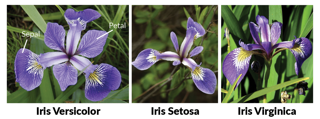
The 3 Iris Classes
Based on Fisher's linear discriminant model, this data set became a typical test case for many statistical classification techniques in machine learning such as support vector machines, and is considered one of the most known in the pattern recognition literature.
-
First you will need to install an interpreter, such as Visual Studio Code, which was the one used for this project, where you can download at: https://code.visualstudio.com/download and all the necessary libraries to run this code, such as pandas, numpy, matplotlib and seaborn, but to make it easier you may install the Anaconda package: https://www.anaconda.com/download/
-
Secondly, download both the dataset file iris.csv and file project.py and open them in the same folder with your interpreter and run the code by typing the command: python project.py
-
Alternatively you may clone this repository from Github by typing the command below: git clone https://github.com/strokk/PS-Project2018.git
-
Before starting the analysis we had to import all the necessary libraries into python as described above, the next step was to actually import the dataset from the file iris.csv using pandas
-
Once the dataset is fully readable by python, I thought it would be good to see some of the data, so I used a code (sample) for illustration on the actual dataset as seen here:

Sample of Dataset
-
Next I checked the total number of rows and columns on the data using the "shape" function
-
Later I separated the 3 Classes of Iris to show how many samples of data there is for each group of class as shown below:

Class Distribution
- Moving to the statistical analysis first I started using numpy to check for the mean of each attribute, but later found out that there is a pandas code (describe) that could check the total count, means, standard deviations, min, 25%, 50%, 75% and max. And this function is interesting, where I could visualize, for example that the sepal length goes from 4.3cm up to 7.9cm and with a mean of 5.84cm. For more information the table is shown below:

Statistical analysis
For some further analysis, I have checked the Min, Mean, Max and Std separately from each class, as shown here:
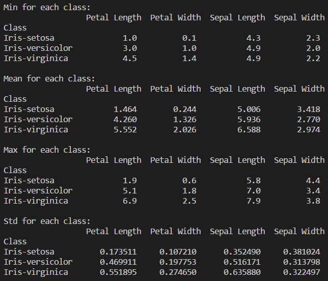
Statistical analysis for each class
Now we can have a better understanding of the species and their correlation and also separately, but only looking at the numbers it's a bit hard to comprehend the analysis, therefore as follows I have generated some plots to facilitate the visualization.
- Histogram: Just as a brief explanation, a histogram is a plot that shows the underlying frequency distribution (shape) of a dataset, thus allowing the inspection of the data for its underlying distribution, outliers, skewness, etc. [3]
First I used Matplotlib to generated a single histogram for each attribute separately, and those images can be found at the images folder, later I have made a single histogram containing all the 4 attributes for better demonstration as shown below:
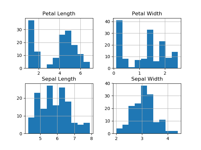
Histogram of attributes
As we can see from the histograms they are very easy to interpret and can give us some good information, for example the Petal Lengh and the Petal Width looks to diverge from the normal distribution, whereas Sepal Lengh and Sepal Width seems to be more symmetric and unimodal.
- Box and Whisker plot: A box and whisker plot displays the variation in a set of data. This kind of plot can provide additional detail while allowing multiple sets of data to be displayed in the same graph. They summarize data from multiple sources and display the results in a single graph. Box and whisker plots allow for comparison of data from different categories for easier, more effective decision-making. A box and whisker plot is developed from five statistics, min value, second, quartile, median value, third quartile and max value. [4]
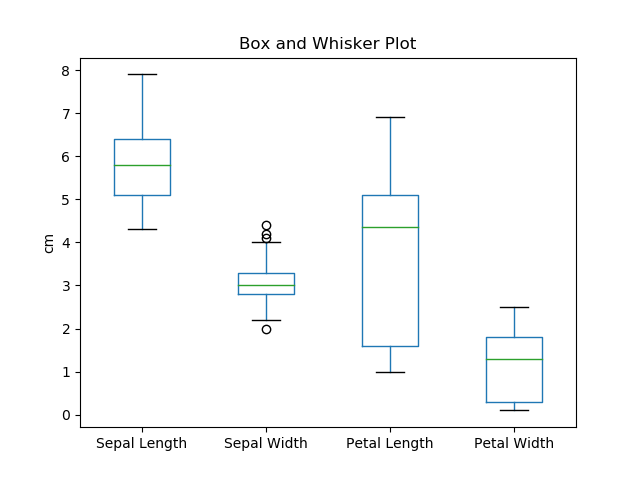
Box and Whisker Plot
As demonstrated from the Box and Whisker plot, we can easily check the range (min and max) between the 4 attributes as well as the median.
- Scatter Plot: A scatter plot is a type of plot or mathematical diagram using Cartesian coordinates to display values for typically two variables for a set of data. If the points are color-coded, one additional variable can be displayed. The data are displayed as a collection of points, each having the value of one variable determining the position on the horizontal axis and the value of the other variable determining the position on the vertical axis. A scatter plot can suggest various kinds of correlations between variables with a certain confidence interval. For example, weight and height, weight would be on y axis and height would be on the x axis. Correlations may be positive (rising), negative (falling), or null (uncorrelated). If the pattern of dots slopes from lower left to upper right, it indicates a positive correlation between the variables being studied. If the pattern of dots slopes from upper left to lower right, it indicates a negative correlation [5]
First I used a function from pandas to generate the scatter plot, but later switched to a function from seaborn, where I generated one single image with various graphs containing all 4 attributes and their correlations between the 3 Classes, as demonstrated below:

Scatter Plot
As demonstrated above, the scatter plot is the most complex plot used on this project, which can demonstrate most of the correlation between the attributes among the Iris dataset. From the plot we can notice that Iris Setosa is completely separataed from the other two classes across all feature combinations, only on Sepal Length and Sepal Width that they are slightly correlated.
Before commencing this online course, I had practilly zero coding experience, only some basic HTML and Java knowledge, on the beginning of lessons I was a bit lost with so much information, specially regarding the Euler exercises, but I decided to try and gather as much information as I could doing researches and watching Youtube videos, and after a while every little piece started to make sense, and when I started this project I had already some better understanding regarding Python, but it was only doing this project that I could actually understand in more depth all the libraries available to use along with Python and to apply all the skills learned throughout the course, and I realised that what could take me hours to do could be easily accomplished with the proper library and some investigation.
And I must say, this project was really interesting, considering that you can do so much with Data Analytics, and this project is an example, you can take a simple flower, with its 3 different species, and when you correlate those attributes together you can gather so much information from it.
[1] https://en.wikipedia.org/wiki/Iris_flower_data_set
[2] http://archive.ics.uci.edu/ml/datasets/Iris
[3] https://statistics.laerd.com/statistical-guides/understanding-histograms.php
[4] http://asq.org/learn-about-quality/data-collection-analysis-tools/overview/box-whisker-plot.html
[5] https://en.wikipedia.org/wiki/Scatter_plot
https://seaborn.pydata.org/generated/seaborn.pairplot.html
https://matplotlib.org/api/_as_gen/matplotlib.pyplot.plot.html
https://machinelearningmastery.com/machine-learning-in-python-step-by-step/