Feature/positioning #2
There are no files selected for viewing
This file contains hidden or bidirectional Unicode text that may be interpreted or compiled differently than what appears below. To review, open the file in an editor that reveals hidden Unicode characters.
Learn more about bidirectional Unicode characters
This file contains hidden or bidirectional Unicode text that may be interpreted or compiled differently than what appears below. To review, open the file in an editor that reveals hidden Unicode characters.
Learn more about bidirectional Unicode characters
| Original file line number | Diff line number | Diff line change |
|---|---|---|
| @@ -1 +1,104 @@ | ||
| # Positioning | ||
|
|
||
| With positioning you can change the location of HTML elements within the visual viewport of the document. | ||
|
|
||
| Positioned elements are important to create complex layouts. | ||
|
|
||
| ## Static | ||
|
|
||
| ```css | ||
| .css-selector { | ||
| position: static; | ||
| } | ||
| ``` | ||
|
|
||
| This is the default value for `position` property, it basically means it's not positioned. | ||
|
|
||
| ## Relative: | ||
|
|
||
| ```css | ||
| .css-selector { | ||
| left: 20px; | ||
| position: relative; | ||
| top: -20px; | ||
| width: 500px; | ||
| } | ||
| ``` | ||
|
|
||
| Relatively positioned elements are offset a given amount from their normal position within the document. The top and bottom properties specify the vertical offset from its normal position; the left and right properties specify the horizontal offset. | ||
|
|
||
| ### Absolute: | ||
|
|
||
| An element that is absolutely positioned is taken out of the flow. It behaves like fixed except relative to the nearest positioned ancestor instead of relative to the viewport. The top, right, bottom, and left properties specify offsets from the edges of the element's containing block. | ||
|
|
||
| ```css | ||
| .css-selector-relative { | ||
| height: 400px; | ||
| position: relative; | ||
| width: 600px; | ||
| } | ||
| .css-selector-absolute { | ||
| height: 200px; | ||
| position: absolute; | ||
| right: 0; | ||
| top: 120px; | ||
| width: 300px; | ||
| } | ||
| ``` | ||
|
|
||
| ### Fixed: | ||
|
|
||
| Fixed positioning is similar to absolute positioning, with the exception that the element's containing block is the viewport. The top, right, bottom, and left properties specify offsets from the edges of the viewport's block. | ||
|
|
||
| ```css | ||
| .css-selector-fixed { | ||
| bottom: 0; | ||
| position: fixed; | ||
| right: 0; | ||
| width: 200px; | ||
| } | ||
| ``` | ||
|
|
||
| ## Sticky: | ||
|
|
||
| Sticky positioning can be thought of as a hybrid of relative and fixed positioning. A stickily positioned element is treated as relatively positioned until it crosses a specified threshold, at which point it is treated as fixed until it reaches the boundary of its parent. | ||
|
|
||
| ```css | ||
| .css-selector-sticky { | ||
| position: sticky; | ||
| top: 60px; | ||
| width: 200px; | ||
| } | ||
| ``` | ||
|
|
||
| ## Normal Flow | ||
|
|
||
| Elements on a webpage lay out in the normal flow, if you have not applied any CSS to change the way they behave. And, as we began to discover, you can change how elements behave either by adjusting their position in that normal flow, or removing them from it altogether. | ||
|
|
||
| First of all, individual element boxes are laid out by taking the elements' content, then adding any padding, border and margin around them — it's that box model thing again, which we've looked at earlier. | ||
|
|
||
| By default, a block level element's content is 100% of the width of its parent element, and as tall as its content. Inline elements are as tall as their content, and as wide as their content. You can't set width or height on inline elements — they just sit inside the content of block level elements. If you want to control the size of an inline element in this manner, you need to set it to behave like a block level element with display: block; (or even,display: inline-block; which mixes characteristics from both.) | ||
|
|
||
| ### Exercise | ||
|
|
||
| 1. create a new branch from master called `feature/positioning`. | ||
| 2. Go to `2-positioning` folder and create a file named `positioning.html`. | ||
| 3. Create a file named `styles.css`. | ||
| 4. Inside the CSS file, create this layout using CSS positioning: | ||
|
|
||
| 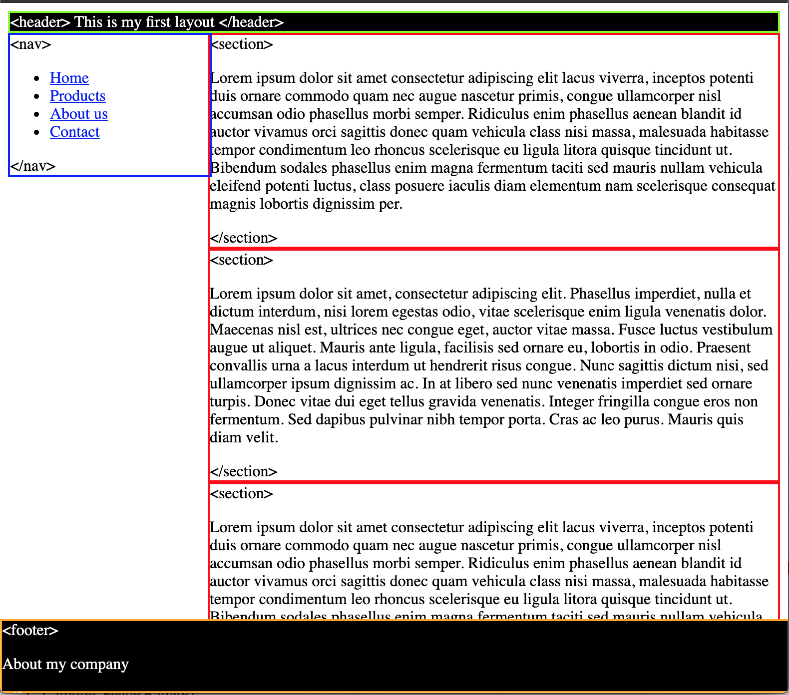 | ||
|
|
||
| * `<header>` sticky, green borders and black background. | ||
| * `<nav>` absolute, blue borders and 200px of width. | ||
| * `<section>` static, red border and it's 200px away from its left. | ||
| * `<footer>` fixed, orange border and it's fixed to the bottom. | ||
|
|
||
| What do you need to make the footer full width and visible? | ||
| Resize your window and double check the responsiveness of your layout. | ||
|
|
||
| 5. Push your changes and create a new PR with your code. | ||
|
|
||
| ### Sources | ||
|
|
||
| * [CSS Position - MDN](https://developer.mozilla.org/en-US/docs/Web/CSS/position) | ||
| * [Learnlayout](http://learnlayout.com/) |
This file contains hidden or bidirectional Unicode text that may be interpreted or compiled differently than what appears below. To review, open the file in an editor that reveals hidden Unicode characters.
Learn more about bidirectional Unicode characters
| Original file line number | Diff line number | Diff line change |
|---|---|---|
| @@ -0,0 +1,36 @@ | ||
| <!DOCTYPE html> | ||
| <html lang="en"> | ||
|
|
||
| <head> | ||
| <meta charset="UTF-8" /> | ||
| <meta name="viewport" content="width=device-width, initial-scale=1.0" /> | ||
| <meta name="author" content="augusticor" /> | ||
| <link rel="stylesheet" href="style.css"> | ||
| <title>Oscar Bosigas positioning</title> | ||
| </head> | ||
|
|
||
| <body> | ||
| <header> | ||
| <h1>This is my first layout</h1> | ||
| </header> | ||
| <nav> | ||
| <lu> | ||
| <li>Home</li> | ||
| <li>Products</li> | ||
| <li>About us</li> | ||
| <li>Contact</li> | ||
| </lu> | ||
| </nav> | ||
|
|
||
| <section> | ||
| <p>Lorem ipsum, dolor sit amet consectetur adipisicing elit. Est culpa aut magni doloribus debitis quam ea veritatis eveniet vitae voluptatem adipisci dolore blanditiis error, voluptatibus porro animi quisquam deleniti. Ducimus.</p> | ||
| </section> | ||
| <section> | ||
| <p>Lorem ipsum dolor sit amet consectetur, adipisicing elit. Labore dolorem odit minima illo vitae nam totam distinctio repellat eaque dicta reprehenderit praesentium aliquam iusto, veniam maxime. Expedita adipisci facere deserunt?</p> | ||
| </section> | ||
| <section> | ||
| <p>Lorem ipsum dolor sit amet consectetur adipisicing elit. Magni sint dignissimos quis repellendus corrupti mollitia pariatur repellat odit eius obcaecati, eveniet, sapiente, nihil saepe. Iure explicabo quisquam tempore placeat expedita.</p> | ||
| </section> | ||
| <footer>About my company</footer> | ||
| </body> | ||
| </html> |
This file contains hidden or bidirectional Unicode text that may be interpreted or compiled differently than what appears below. To review, open the file in an editor that reveals hidden Unicode characters.
Learn more about bidirectional Unicode characters
| Original file line number | Diff line number | Diff line change |
|---|---|---|
| @@ -0,0 +1,25 @@ | ||
| header { | ||
| background-color: black; | ||
|
Contributor
There was a problem hiding this comment. green borders are missing. |
||
| border: 2px solid green; | ||
| color: white; | ||
| position: sticky; | ||
| } | ||
|
|
||
| nav { | ||
|
Contributor
There was a problem hiding this comment. blue borders and 200px of width are missing. |
||
| border: 2px solid blue; | ||
| position: absolute; | ||
| width: 200px; | ||
| } | ||
|
|
||
| section { | ||
| border: 2px solid red; | ||
| margin-left: 200px; | ||
| position: static; | ||
| } | ||
|
|
||
| footer { | ||
| background-color: brown; | ||
| border: 2px solid orange; | ||
| font-style: italic; | ||
| position: fixed; | ||
|
Contributor
There was a problem hiding this comment. orange border and it’s fixed to the bottom. |
||
| } | ||
This file contains hidden or bidirectional Unicode text that may be interpreted or compiled differently than what appears below. To review, open the file in an editor that reveals hidden Unicode characters.
Learn more about bidirectional Unicode characters
| Original file line number | Diff line number | Diff line change |
|---|---|---|
| @@ -1 +1,75 @@ | ||
| # Box model | ||
|
|
||
| CSS box model is a container which contains multiple properties including borders, margin, padding and the content itself. It is used to create the design and layout of web pages. It can be used as a toolkit for customizing the layout of different elements. The web browser renders every element as a rectangular box according to the CSS box model. | ||
| Box-Model has multiple properties in CSS. Some of them are given below: | ||
|
|
||
| * borders | ||
| * margins | ||
| * padding | ||
| * Content | ||
|
|
||
| Image of Box Model | ||
|
|
||
|  | ||
|
|
||
| * `Content box`: The area where your content is displayed, which can be sized using properties like width and height. | ||
| * `Padding box`: The padding sits around the content as white space; its size can be controlled using padding and related properties. | ||
| * `Border box`: The border box wraps the content and any padding. Its size and style can be controlled using border and related properties. | ||
| * `Margin box`: The margin is the outermost layer, wrapping the content, padding and border as whitespace between this box and other elements. Its size can be controlled using margin and related properties. | ||
|
|
||
| When you set the width of an element, the element can actually appear bigger than what you set: the element's border and padding will stretch out the element beyond the specified width. Look at the following example, where two elements with the same width value end up different sizes in the result. | ||
|
|
||
| ```css | ||
| .css-selector-500 { | ||
| margin: 20px auto; | ||
| width: 500px; | ||
| } | ||
|
|
||
| .css-selector-bigger { | ||
| border-width: 10px; | ||
| margin: 20px auto; | ||
| padding: 50px; | ||
| width: 500px; | ||
| } | ||
| ``` | ||
|
|
||
| Can you calculate the width of the `css-selector-bigger` element? | ||
|
|
||
| ## box-sizing | ||
|
|
||
| So you had to use some math to calculate the width of the elements, so this was considered unintuitive, that's why `box-sizing` property appeared, when it is applied on an element, the padding and border of that element no longer increase the width. | ||
|
|
||
| ```css | ||
| .css-selector-500 { | ||
| box-sizing: border-box; | ||
| margin: 20px auto; | ||
| width: 500px; | ||
| } | ||
|
|
||
| .css-selector-bigger { | ||
| border-width: 10px; | ||
| box-sizing: border-box; | ||
| margin: 20px auto; | ||
| padding: 50px; | ||
| width: 500px; | ||
| } | ||
| ``` | ||
|
|
||
| What's different? | ||
|
|
||
| ## Exercise | ||
|
|
||
| 1. create a new branch from master called `feature/box-model`. | ||
| 2. Go to `3-box-model` folder and copy the file from positioning exercise and rename it as `box-model.html`. | ||
| 3. Also copy the file `styles.css`. | ||
| 4. Inside the CSS file, set the `<section>` elements to not overlap the `<nav>`. | ||
| 5. Update the `<nav>` styles so the 200px of width are set by padding and border, meaning you can't use the `width` property but the same width needs to remain. | ||
| 6. Can you make the `<nav>` links to occupy the full width of its container? | ||
| 7. Push your changes and create the PR. | ||
|
|
||
| Extra: Read about `display` property and find out how it can affect the elements flow in the document. | ||
|
|
||
| ### Sources | ||
|
|
||
| * [CSS Box model - MDN](https://developer.mozilla.org/en-US/docs/Learn/CSS/Building_blocks/The_box_model) | ||
| * [Learnlayout - Box Model](http://learnlayout.com/box-model.html) |
This file contains hidden or bidirectional Unicode text that may be interpreted or compiled differently than what appears below. To review, open the file in an editor that reveals hidden Unicode characters.
Learn more about bidirectional Unicode characters
This file contains hidden or bidirectional Unicode text that may be interpreted or compiled differently than what appears below. To review, open the file in an editor that reveals hidden Unicode characters.
Learn more about bidirectional Unicode characters
This file contains hidden or bidirectional Unicode text that may be interpreted or compiled differently than what appears below. To review, open the file in an editor that reveals hidden Unicode characters.
Learn more about bidirectional Unicode characters
Add this suggestion to a batch that can be applied as a single commit.
This suggestion is invalid because no changes were made to the code.
Suggestions cannot be applied while the pull request is closed.
Suggestions cannot be applied while viewing a subset of changes.
Only one suggestion per line can be applied in a batch.
Add this suggestion to a batch that can be applied as a single commit.
Applying suggestions on deleted lines is not supported.
You must change the existing code in this line in order to create a valid suggestion.
Outdated suggestions cannot be applied.
This suggestion has been applied or marked resolved.
Suggestions cannot be applied from pending reviews.
Suggestions cannot be applied on multi-line comments.
Suggestions cannot be applied while the pull request is queued to merge.
Suggestion cannot be applied right now. Please check back later.
There was a problem hiding this comment.
Choose a reason for hiding this comment
The reason will be displayed to describe this comment to others. Learn more.
This element is not being sticky. double check the functionality.
There was a problem hiding this comment.
Choose a reason for hiding this comment
The reason will be displayed to describe this comment to others. Learn more.
you need to set a top property so the sticky works.